Author Archives: Steven McKenzie

The Lockitron Has Arrived! Home Automation Moved Forward…

What is Lockitron?

A long, long, time ago (Ok, so it was just a bit over a year ago), I came across a preview online for a product called a Lockitron.  This device seemed really, really cool.  I could remotely lock and unlock my deadbolt to my house using only a single swipe from my phone.  Furthermore, I could easily allow access to a friend, family member, etc., into my house, either by remotely unlocking it for them, or by granting them access to be able to unlock it themselves using their own phone.

This seemed like a wonderful idea to me!  No longer did I have to dread the issue of taking the dogs for a walk.  You see, our house has the wonderful idea of ONLY providing a lock via the deadbolt.  The normal door handle itself doesn’t have a door lock.  So, every time, we had to leave to go for a walk, (or to leave the house in general!), we had to manually pull the keys back out, and lock the deadbolt from the outside.  What a pain in the butt!

Then along came the Lockitron, and I was sold!  I threw down my money, and waited for the device to come in, which was scheduled to be shipped in March of 2013.

And I waited…  and waited… and waited.  March came and went, May came and went, July came and went, and September came and went.  Each month promised a shipment of my Lockitron, and each month passed without my Lockitron arriving at my doorstep.  What started to seem like vaporware eventually faded away, when TODAY my Lockitron finally arrived.  Happy Days!

The Hardware

When I got home from work, I barely had set my stuff down before I was diving into the packaging, ripping off that USPS packaging and diving into the heart of what I wanted!
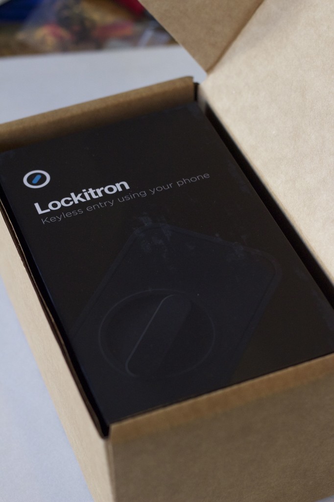
It's here, it's finally here!  I can't believe it!  (And yes, I did have to take this picture before even pulling it out of the packaging box!)

It’s here, it’s finally here! I can’t believe it! (And yes, I did have to take this picture before even pulling it out of the packaging box!)

The package came pleasantly packaged, stuffed inside of a cardboard box, wrapped up inside of a USPS slightly padded bag.  After pulling the Lockitron box itself out of the cardboard box, I was greeted with a nicely decorated box.

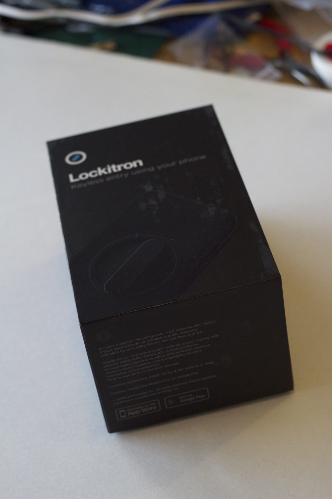
The Lockitron box, in all its glory.

The Lockitron box, in all its glory.

The front of the box didn’t display too much information, but did show a nice image of the device.

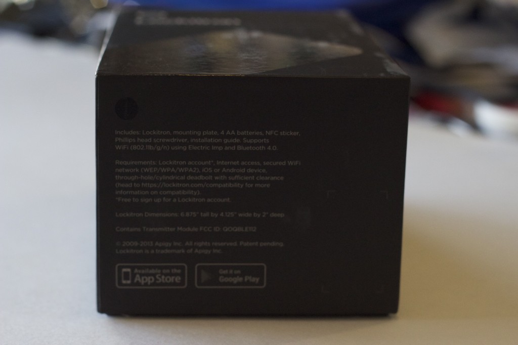
Just your usual, run-of-the-mill information.

Just your usual, run-of-the-mill information.

The bottom of the box showed a simple bit of information, directing the user to the Apple App Store, or the Google Play Store to download their respective version of the software to go with the device.

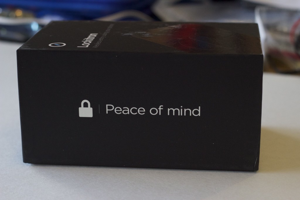
Peace of Mind?  We'll see after I do some extensive testing of it!

Peace of Mind? We’ll see after I do some extensive testing of it!

One side of the box said exactly what the device was meant to do: provide peace of mind, allowing you to always be able to check on the lock status of the door.

As long as it works well, I'm excited about this!

As long as it works well, I’m excited about this!

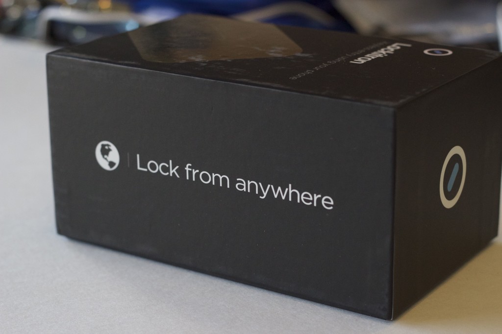
The other side of the box complimented the other statement, expressing the ability to lock the device from anywhere.  Peace of mind?  You betcha!

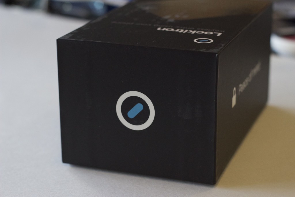
Ooh, a pretty logo!

Ooh, a pretty logo!

The remaining side of the box simply displayed Lockitron’s logo: a simple round outline, surrounding a deadbolt-style lock icon.  You better get used to this icon – it’s everywhere in the software!
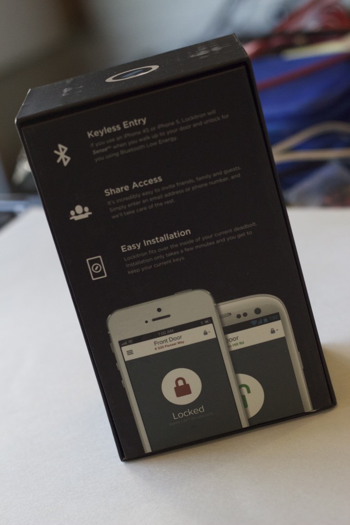
Yes, the installation was easy.  Unfortunately, the whole fact of Bluetooth unlock only working with iPhones irritates me.  No love for Android?

Yes, the installation was easy. Unfortunately, the whole fact of Bluetooth unlock only working with iPhones irritates me. No love for Android?

The backside of the box provided a bit more information as to the contents and functionality of the device.  I was disappointed to know that the bluetooth functionality of being able to be near and lock / unlock the device was functionality restricted only to iPhones.  Hopefully Lockitron will add that functionality to their Android counterparts in the future.

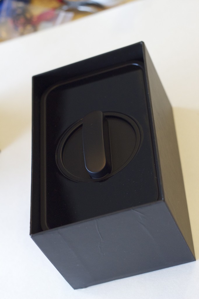
The Lockitron faceplate has been revealed!

The Lockitron faceplate has been revealed!

Removing the cover of the box revealed the plastic Lockitron faceplate.  I originally ordered the white / brushed nickel faceplate, to better match the decor at our house.  Lockitron manufacturers, unfortunately, are having some problems with their manufacturing at the moment.  As a result, they decided to go ahead and ship out the black-on-black faceplates for now, and ship the originally ordered version later on down the road.

A good gesture, yes.  But still a bit disappointing, seeing as how it’s already so far behind.  But I certainly do appreciate the gesture, and the ability to get it out the door sooner.

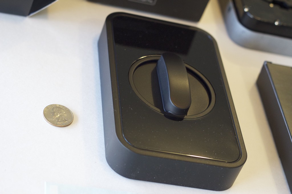
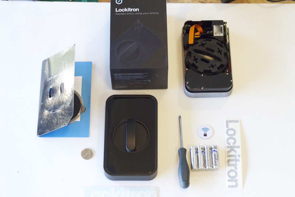
Just the faceplate, with a quarter for comparison.  Huge!

Just the faceplate, with a quarter for comparison. Huge!

Pulling the faceplate out of the box reveals just how huge the device is overall!  Of course, I’m sure I could’ve assumed it’d be the size it was after thinking about all the components and electronics inside of it.  But I guess I had falsely assumed it’d be closer to the size of the deadbolt itself, especially when compared to some of the alternatives that are starting to be released to market by other manufacturers.

I assume this is the core group of developers?

I assume this is the core group of developers?

Underneath the faceplate was a box with some instructions in it, as well as the deadbolt backplate to get installed on the door.  Wrapping it was a nice signature folio of people, which I assume to be the core group of developers / designers.

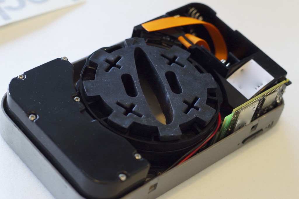
The brains of the whole operation.  It's heavy too!

The brains of the whole operation. It’s heavy too!

Underneath all of that was the brains behind the entire system.  This houses the primary motor assembly, wifi chip, rubber surround to keep from scratching the deadbolt, and battery compartment to help run the entire device.  It’s pretty sweet!
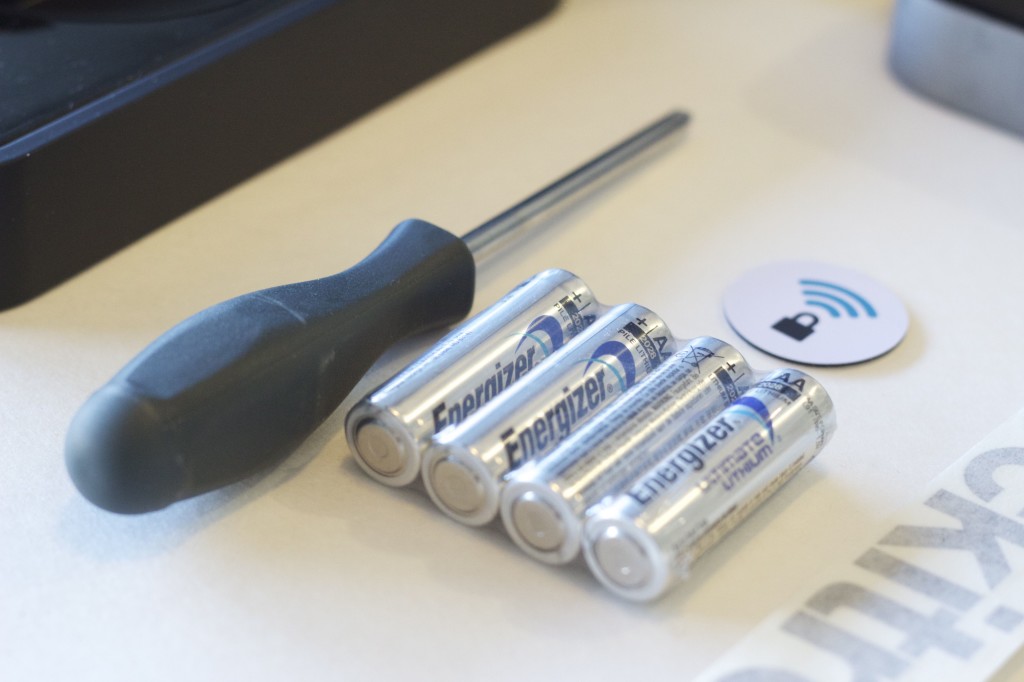
 

This was a nice touch!  I was pleasantly surprised to see a set of nice batteries that came with it, as well as a screwdriver for installing the backplate to the deadbolt!

This was a nice touch! I was pleasantly surprised to see a set of nice batteries that came with it, as well as a screwdriver for installing the backplate to the deadbolt!

Included in the box was a package of accessories.  I ripped into the box, and was extremely pleased with what came with it.  One item, a small NFC tag, was included to allow for easy tap-and-use functionality.  In addition was a set of 4x AA batteries, which were of surprisingly high quality (not those crappy knockoff brand ones that have such a small amount of storage and don’t last very long)!  Lastly, I was quite surprised to see a full sized screwdriver in there as well!  This is to help loosen the deadbolt framing in order to be able to slide the backplate into it.  Now, I know that almost everyone probably already has a screwdriver that they could use instead.  But the very act of including one, which made it so that I didn’t have to divert my attention away from installing the Lockitron, and instead remain focused on doing it with all the tools necessary right in front of me, was quite nice!

Everything that comes included with the Lockitron - even stickers!

Everything that comes included with the Lockitron – even stickers!

Oh, yes – there were also a couple Lockitron stickers / window decals as well!  Another fun touch for those of us who like to make our stuff go faster with stickers!

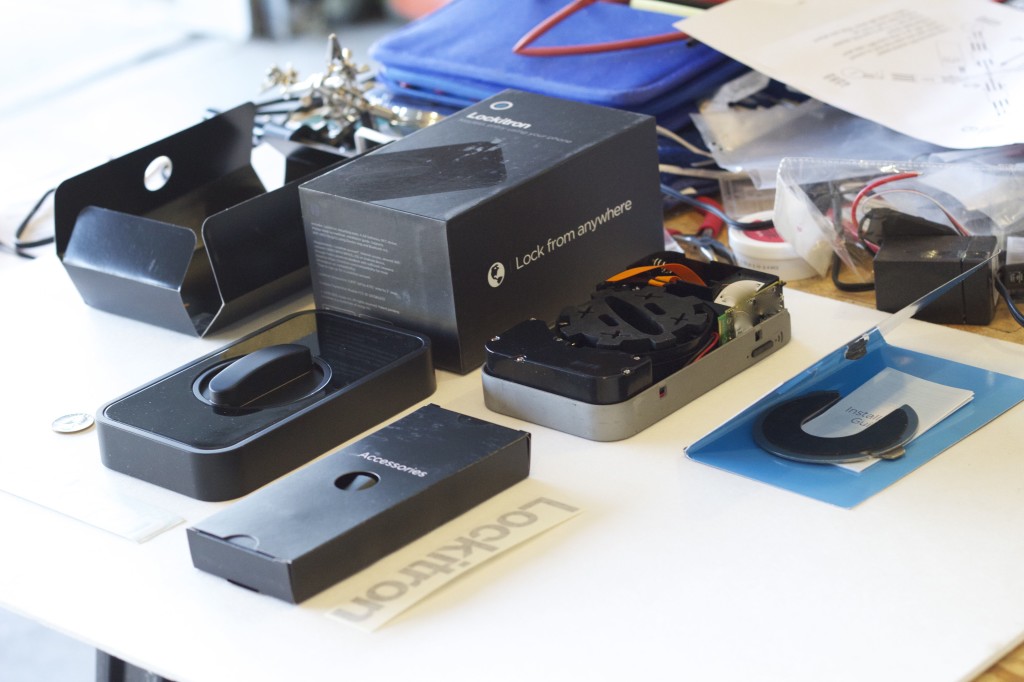
Another angle of all the stuff that comes with it!

Another angle of all the stuff that comes with it!

The Installation

I didn’t take any pictures of the installation process itself, but that’s because it was quite simple and uneventful.  Basically, it consisted of me downloading the Lockitron app, logging into my account, setting up a wifi connection, and then utilizing BlinkUp to transmit the data (assuming wifi data + user account data) to the Lockitron in order to authenticate it and activate it online.

Once the process was complete and the Lockitron was authenticated with the network, the remaining process was simple, and was all done via a video guide over the phone.  The guide walked through the remaining process of installing the backplate, snapping the Lockitron frame onto the guide, configuring the Lcokitron to know whether it was locked or unlocked, and finally putting on the rubber stopper and plastic cover frame.  It was definitely quite the easy setup for something that could’ve easily been so much more complicated!

The Final Product

Once the device was installed and working, all that was left was to try it!  I quickly booted up the app on my phone and switched the device to be locked…. and waited.  About 10 second later, I heard the familiar sound of gears running, and the device was locked!  I then tried swiping on my phone to unlock it, only to find that the app was frozen…  Drat!

I hopped onto my laptop to bring up the web interface to try it out.  it showed that the device was locked, so I pushed the button to unlock it.  About 30 seconds later, the gears sounded, and it unlocked.  Woot!  But wait…what’s this?  The web interface stated that there was a system error, and to try again later.  Um, not good?

I refreshed the page, and it then showed the device was unlocked, like it was supposed to be.  I went ahead and clicked the lock button, and waited.  30 seconds or so again later, and it was locked, but shortly thereafter I received another system error message.  A simple refresh of the page later, and all was good again.

I went back to my phone to try again, and again I got the familiar response: swiping it to lock (or unlock) the device would work, but then the entire system would lock up again for a period of time.  After doing some testing, I believe it to be that the centralized Lockitron server must be waiting for some confirmation from the device stating that the command had been received and processed.  During this time, it appears to make the entire system unresponsive while it’s waiting for the response back.  Hopefully this will be changed in the near future.  But in the meantime, at least I know to give it some time before trying to send another command.

I did give it a real-world situation tonight, where I left for a walk, and locked the door on my way out.  When I got home, the door was in fact locked.  But pressing unlock on my phone did nothing.  I waited, and waited, but nothing ever happened, and the door remained locked.  But about 60 seconds later, it finally made the familiar gear sound, and the door opened up for me.  So there appears to be a few kinks in lag time and response issues that still need to be worked out.  Hopefully the Lockitron team will get those issues ironed out, and have a rock-solid product in the end!

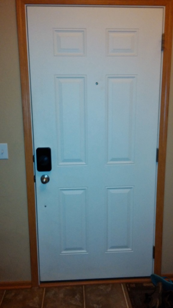
I’d have to say that I’m happy overall with the product.  I do have a few pictures of the final installation that I grabbed with my cellphone quickly (I forgot to take them with my nicer camera before posting!):
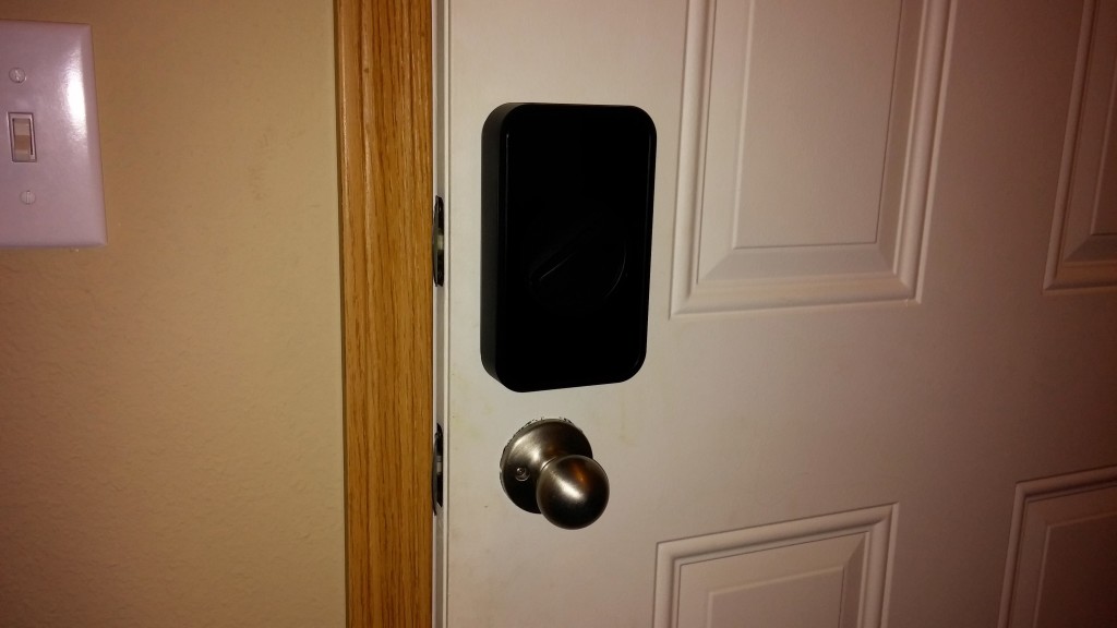
A view of our entire door with the Lockitron installed on it.

A view of our entire door with the Lockitron installed on it.

A closeup picture of the Lockitron installed on the door.  It's  a bit hard to see, but it gives you an idea of the size of the device!  It's much larger than I originally thought it'd be.

A closeup picture of the Lockitron installed on the door. It’s a bit hard to see, but it gives you an idea of the size of the device! It’s much larger than I originally thought it’d be.

As you can see, the device is quite large.  It’s not obtrusively large, but it is definitely something that may catch you off guard at first.  But I think after a few days or so I won’t even really notice, and we’ll get used to it.  And once Lockitron sends out the color that we ordered, hopefully we’ll be able to make it match even better with the rest of our decor.

The Verdict

Lockitron
Pricewww.dyerware.comwww.dyerware.comwww.dyerware.comwww.dyerware.comwww.dyerware.com
Great price for what it does. Lots of functionality, and seems to be a pretty solid product.
Featureswww.dyerware.comwww.dyerware.comwww.dyerware.comwww.dyerware.comwww.dyerware.com
Lots of features. Includes a knock sensor, which I haven't tried yet. Supports limited bluetooth, NFC, app integration, an external APK and text messages.
Supportwww.dyerware.comwww.dyerware.comwww.dyerware.comwww.dyerware.comwww.dyerware.com
Limited support so far. Good Facebook response, but limited service when trying to determine rollout times. Iffy customer service leaves some worry with regards to warranty support and other new-product bugs.
Aestheticswww.dyerware.comwww.dyerware.comwww.dyerware.comwww.dyerware.comwww.dyerware.com
Decent looking product. Hides well on the inside of the door, and can't tell there's anything from the outside. A bit bulky and awkward on the inside, though.
Qualitywww.dyerware.comwww.dyerware.comwww.dyerware.comwww.dyerware.comwww.dyerware.com
Hard to tell so far, since it's brand new. Seems solid. Gears are a bit loud when it runs. Not sure if that means anything with regards to lasting power.
Setupwww.dyerware.comwww.dyerware.comwww.dyerware.comwww.dyerware.comwww.dyerware.com
Piece of cake to set up. The video installation instructions were spot on, and overall the BlinkUp feature made it a breeze. I had one small snag, where the BlinkUp took, but the Lockitron didn't want to communicate with the network. A simple second attempt to BlinkUp worked out.
Overallwww.dyerware.comwww.dyerware.comwww.dyerware.comwww.dyerware.comwww.dyerware.com
Overall, seems like a decent product. I'm a bit biased, since I was a Day One backer when it was promoted to the market, so I was super excited for it to come in. But at the same time, I'm a bit flustered, since it took twice as long to come to market. I'm glad it's out, and I am looking forward to giving it a run for its money. I appreciate all the detailed engineering that went into it, and loved the simple, easy to set up ability of it. Great idea using BlinkUp to do most of the heavy lifting!

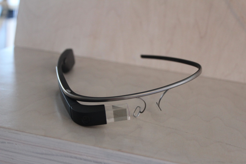
Go Go Google Glass – We Have Glass! (A Traveler’s Review)

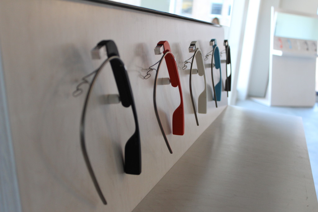
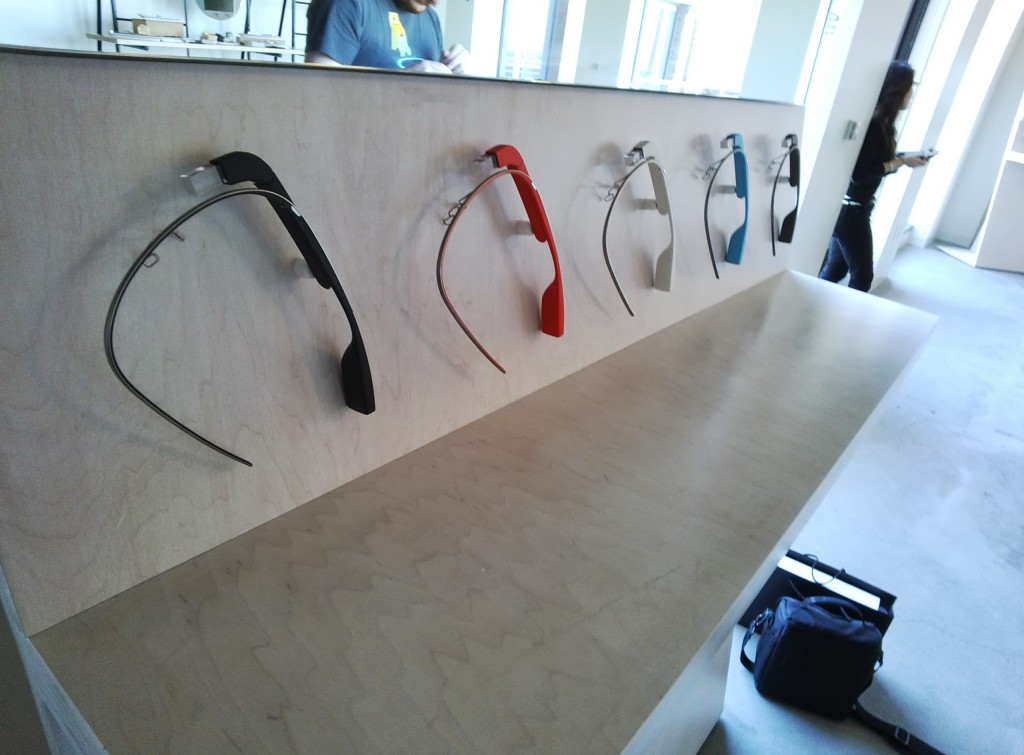
Very nice Google Glass display, demonstrating all the colors of glass.

Very nice Google Glass display, demonstrating all the colors of glass.

A Recap

A bit over three months ago, I received an unexpected notification from Google, stating that

Hi, thanks for applying!  We’d like to invite you to join our #glassexplorers program.  We’ll be sending you a private message with more details in the coming weeks – keep an eye on our stream at Project Glass.”

I then waited patiently for an update from Google for a chance for me to get my Glass.  And I waited…..and I waited….and I waited…..and waited some more.  I saw Google send out notifications to last year’s Google I/O attendees who preordered one.  I then saw people, one by one, pop up on Google+ after that stating that they had finally been notified that they were to get their glass, and that they were on their way to get them (or had just gotten them).

I continued to wait rather impatiently, until one day I received a surprise notification from Google, which I can’t seem to find on my page anymore (+Google Glass, did you delete that post off of my page after the fact?), that basically said (paraphrased):

It’s time to pick up your Google Glass!  Please follow your special link to sign up and schedule your Glass appointment.

Woot!  However, there was only one problem – I had to pay to flow out and get it.  And from where I lived, it was about $500-$700 per person to fly out and get it.  So, at a cost of bringing another person with me to pick up Glass, it was going to cost me in the ballpark range of from $2,500 to $3,000 just to pick up something still in early Beta phase, unreleased to the public.  I had a month to decide, and boy did it take me all of that month to decide if I wanted to get Glass.  I went back and forth, wondering if I’d have time to use it to its full potential, and if it was worth buying just to play with and develop lightly against.  After a month, I finally decided:

Heck yes!  It is totally and completely worth it, to be one of 8,000 Explorers to have Glass, and have something that a huge population is clamoring over each other to see and play with.  I am a geek, and I would love to do this!

So I did!  I clicked my link, paid my money, scheduled my appointment, purchased plane tickets, drove to the airport, and began my trip to go pick up Glass!

The Trip There

I decided to fly into San Francisco to pick up my glass.  The airline tickets were the cheapest, I had some friends there who I wanted to see, and (most importantly), since I waited so long to sign up, it was the only place who had some openings left during the weekend for me to pick up my Glass, since I didn’t want to have to take vacation from work if I didn’t need to.

After arriving in San Francisco and making it down town to The Embarcadero district, I had the daunting task of figuring out where the heck to go.  Google gave me instructions as to which address to go to, but nothing about how to actually find their office once I got there.

I arrived at the address, looked up, and noticed that there were some Google Chrome stickers on the windows of a few offices up on around the fifth floor (where I was supposed to end up).  There was one problem, however – no elevators!  And I was getting close to my designated fitting time to get my glass.  I wasn’t going to have come all this way and spend so much money, only to miss my appointment because I couldn’t find a damned elevator!

After wandering for a few minutes, I finally found a security guard, who was kind enough to help me – someone who looked completely lost and helpless!  After telling him who I was, and what I was there for, he graciously let me through locked doors to the front desk where I needed to check in.  After checking in, I was shuttled upstairs to another checkin area, and finally ushered into a large room.  There, in the front of the room right as I entered the door, was a large wooden sign, telling me I was in the right place – GLASS.

The awesome display that greeted me when I walked into the building!

The awesome display that greeted me when I walked into the building!

Woot!

The Delivery

After initially arriving, I was once again questioned as to who I was, and that I was where I was supposed to be.  After authenticating for the third and finally time, I was directed to a waiting area, and was told that my guide would be coming out shortly, and to feel free to play with the display Glass at one of two display stations in the waiting room.  There was also a large table full of a bunch of hor d’oeuvres for me to choose from.  Unfortunately I wasn’t hungry, as I had just scarfed down an amazing sandwich from a place down the street.  Fairly close to the table of snack’ems, however, was a lovely refrigerator, full of water, and beer!  They even told me that there were a number of other drinks that I could request, if I was interested.

I wasn’t.  I just wanted a glorious beer in the fridge!  Thus began my saga of trying Glass, with an amazing beer in my hand!

Snacks at the Google Glass event.

Snacks at the Google Glass event.

Quenched of my thirst, I began trying out various colors of Glass that they had out on display.  I had previously ordered the Charcoal color there.  But, now that I had a chance to try them all on, the decision became much tougher.  I kept going back and forth between the Charcoal and the Shale colors, and dabbled a bit with the Tangerine.  One of the Glass Guides who was there directed me to the Shale, but eventually I ended up deciding to go with the Charcoal.  I wanted something subtle that didn’t stick out too much, as I wanted to be a bit less noticeable walking around with Glass.  After making my decision and choosing Charcoal, the initial guide who was with me left, and told me to wait until another guide came out with my Glass.  This one would help me to do the fitting, and answer any questions about Glass.

After much deliberation, I finally decided to go with Charcoal!

After much deliberation, I finally decided to go with Charcoal!

Not more than a minute or two after she left, the next guide arrived, complete with my Glass!  This is it, I thought.  I’m finally getting glass!

The fitting started easily enough.  The guide graciously opened up the box for me (damn tape!).  She had a better ability than my short fingernails to carefully open up the tape on the box so that it didn’t damage the box.  Once the tape was off, she graciously handed it to me so that I could have the honors of opening the box and opening Glass.  After pulling the box off and opening it up and pulling the sticky paper back, there it was – my Glass!

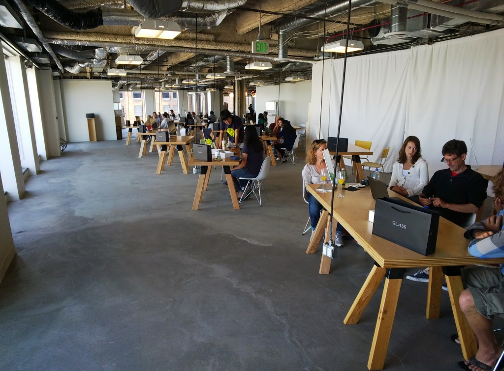
Display of the office where I got Glass.

Display of the office where I got Glass.

The Fitting

The first step in our process was to make sure that the Glass fit right across my head.  Everyone’s heads are different, and so it’s initially molded to fit the average person’s noggin.  Fortunately in my case, it was just a bit too wide.  When I messed with the touchpad on the side of Glass, it would slightly bounce up and down on my face.  In order to correct this, the titanium frame needed to be slightly adjusted to better fit my face.  I gave my Glass to the guide, who then proceeded to fold it into the shape of an X.  HOLY CRAP!

She assured me that it was just fine.  All one needed to do in order to reshape the frame was to bend it into a bit more of an extreme position compared to where it currently was, and hold it there for about 30 seconds.  This would force the frame to reshape itself into the new shape, and that there was no damage done to it.  (*PHEW!*)

I put it back on my noggin and once again played with the touchpad.  This time it worked like a champ, and there was no movement detected at all.  With that checked off the list, it meant that we were good to go!

I was told to press the power button, and let it boot up.  I hit the power button, and about 5 seconds later, was greeted with a glorious “GLASS” display on my glass, right in front of my eye.  AWESOME!  Once Glass was booted up, my guide took me through the process of configuring Glass to work with my Android Phone (an older Galaxy Nexus – I can’t wait to upgrade!).  She then had me log into my account on her Chrome Pixel, and set up WiFi and other miscellaneous access that way (Side note – the Pixel is nice, but I love my 13″ Retina MacBook Pro so much more.  But that’s an entirely different blog post in itself!)

Once we were all set up, synced with my phone via bluetooth, connected to the Google office’s WiFi, and set up with my account, we were good to go!  (Another side note – I am nervous to see my Verizon cellphone bill at the end of the month.  I’m grandfathered on the unlimited data plan, which means I won’t see an absurd data charge.  However, this also means I don’t have tethering for free.  It’ll be interesting to see if Verizon sees the tethering traffic between my phone and Glass and tries to charge me for tethering, or if they just see the data traffic for the MyGlass app.  We’ll see!)

The view from the balcony at the Google Glass event.

The view from the balcony at the Google Glass event.

Another view from the balcony at the Google Glass event.

Another view from the balcony at the Google Glass event.

My guide took me onto their balcony outside their office, overlooking a number of piers, and a beautiful view of the Bay Bridge.  Once outside, I was walked through the steps of taking a picture, taking a video, making a phone call, and sharing pictures.  I was able to do a few quick Google searches, and overall just getting a grasp of Glass itself.  Once the guide felt that I had a comfortable grasp of Glass, she let me go on my way!  8 hours of flight time there, an hour of driving into San Francisco, and only a 30 minute fitting session, and I was let loose into the world with it.

And boy, did I not know what to do with it!

Author’s note – When I started this post, I had every intention of actually going in depth into the hardware and usability of Glass itself.  Unfortunately, the fitting and travel took long enough, that I think it best if I break it apart into two separate posts.  Stay tuned for a new post in the next couple days, giving a much more detailed experience about Glass!  In the meantime, however, I’ve included a few pictures and video from the event, to give you a sneak peak of the quality of the pictures and video that can be taken from Glass.  Enjoy!

Picture of the Google Glass display, through Google Glass.

Picture of the Google Glass display, through Google Glass.


Picture of the Google office, through Google Glass.

Picture of the Google office, through Google Glass.

– admin

A Continuation of Why Network Solutions is Awful…

This is a small update, but an important one, nonetheless…

As mentioned in an earlier post, I just recently switched my hosting to a new host.  After getting fully switched over, I decided to rerun my test that I made to check the MySQL query performance of the database on the host.  I set up the exact same test, with the exact same code, and got the following result:

New Host: Total Time – 0.03s, Average Query Time – 0.000031s

Let me just repost what I had on the previous entry:

Network Solutions:  Total Time – 5.9s, Average Query Time – 0.0059s
1and1: Total Time – 0.293s, Average Query Time – 0.0003s
Local MBA with a SSD: Total Time – 0.078s, Average Query Time 0.000078s a query

What does this say?  It says:

  • My new host is 10x faster than my old host.
  • My new host is over 2x faster than my MBA with an SSD!
  • My new host is 197x faster than Network Solutions!

Let’s just let that sink in for a moment…  I was satisfied with my previous host.  I am blown away that my new host performs DB queries even faster than my MacBook Air!  But I’m in total and utter shock at how much faster it is than our Network Solutions account.  And no, I’m not using a VPS or a dedicated server.  I am still on the same-o shared hosting type of plan that I was on before.

Tsk tsk… you disappoint me, Network Solutions.

Sorry for the Downtime!

A Quick Note

Just a quick note about the downtime that occurred overnight.  I migrated my domain from one host to another, to help consolidate some of my outlying hosts.  Consequently, the blog was down while the DNS records propagated, and data was migrated, both on the front end and the backend.

Please let me know if you notice any unusual behavior after the migration, and I’ll fix accordingly.  Sorry for the inconvenience!

– admin

Network Solutions – How NOT to Host a Website!

Preface

OK, so normally I try to remain positive with regards to most services.  While I have experienced frustrating, and sometimes downright horrible service before, I can usually withhold my anger and frustration as much as possible, since it’s normally not the representative’s fault whom I deal with.  Furthermore, I’ve been on both sides of the customer service conversation before, ad I understand what it’s like to be on the service side as well, and know that getting frustrated and angry doesn’t resolve the situation any better.  I also know how the customer can get frustrated and out of sorts with their experiences with customer service.  Once the support process gets to that point, productivity usually drops to zero, and nothing can be further figured out or resolved.  So, I usually do my part to maintain a level of understanding and respect, and try not to spread negative frustrations about such an encounter.  However, in the case of Network Solutions, I have reached a point of boiling frustration, that cannot be resolved.  While it will do no good to write about my encounters with Network Solutions, as they have been around a long time and appear to have little concern for the frustrations of their customers.  At the very least, however, it will help release a bit of the frustration pressure of my experiences with them, and may save some readers the headaches of dealing with them, by warning them ahead of time against going with Network Solutions, and going with a different registrar / host instead.

Initial Experiences

When I took over control of a few websites, I quickly found out that the websites were hosted through Network Solutions.  Now,  I hadn’t dealt with Network Solutions for quite a long time, so I didn’t think too much about it, and figured that the bad reviews and complaints I had read about online were overreactions, and that they weren’t as bad as initially assumed.  So, I didn’t put too much thought into it, and began my work with them, using their “Website Builder Tool” that my predecessor had decided to use to build the website.  This worked “OK”, for the most part, but provided a severe amount of limitations and frustrations that quickly grew to anger me every time I used it.  I, a web developer, was severely constrained by using their WYSIWYG tool, and being unable to provide any of my code to create a better, more interactive, dynamic website.  After further inspection, I noticed that we were hosted on a Windows Server, which meant no MySQL or PHP.

Grr…

So I contacted Network Solutions to see about what to do to switch services over to a Linux host instead, so I would have better access to the tools that I needed.  A few days passed, and I got a response back from them saying that they couldn’t do a transfer, and I had to set up a new hosting package with them, manually transfer what I wanted over, cancel the existing hosting package, and then they would credit back the remaining time on my existing package.

WHAT?!

This would result in insurmountable downtime while attempting to transfer hosting packages, domain names, etc. from one account to another; not something recommended for a live, commercial website.  So, I rescinded my request to transfer to a Linux server, and instead left it as is.

A .DOCX File Is not a .ZIP File

After doing some additional work on the site, I uploaded a .DOCX file, and linked to it for download by our customers.  It seemed to work OK, until I started getting some complaints from our customers that they were unable to properly download the .DOCX file.  After doing some checking, I noticed that if I clicked the link to the file in Chrome, Safari, or Firefox, it downloaded properly as a .DOCX file.  But if I did it using IE, it instead downloaded as a .ZIP file.  I could change the extension of the .ZIP file back to a .DOCX file and it would work fine, but it was unacceptable to expect our users to have to change the extension, just because the webhost was having an issue serving up a .DOCX file.

I did some research, and came across the solution – apparently if the host doesn’t properly have the MIME types configured on their server, it won’t properly serve .DOCX (or .XLSX, .PPTX, etc., for that matter) files to the user’s browser.  If the MIME type is missing, the server will not know how to server it, and will instead rely on the browser trying to figure it out (which Chrome, etc. could figure out).  IE obviously couldn’t do, and as such resorted to downloading it as a .ZIP instead.  Even though .DOCX files had been around since 2007 (six years ago), Network Solutions still hadn’t made the jump on our shared Windows host to properly serve those types of files!

I sent Network Solutions a support ticket, explaining in detail what the problem was, and got this response back from them:

I am sorry to hear of your difficulties you are having with your nsHosting. We were able to replicate the issue however the file opened properly and saved as a .docx. We would suggest saving the file as a .doc to prevent the file type confusion.

What.  The.  Hell?  First off, I got lost when they told me that they could replicate the issue, but yet it opened and saved as a .DOCX.  That made no sense to me.  Secondly, the suggested that I save it as a .DOC instead, to resolve the problem!?  I’m supposed to save it as a 7+ year old file format, so that the server properly streams the document to clients’ browsers?  Adding an entry into the list of MIME types on the servers is child’s play.  I couldn’t believe such an asinine recommendation from them!  Unfortunately, this was only a sign of horrible things to come from them…

Death to the WYSIWYG!

Fast forward a time, and I’m still struggling with dealing with Network Solutions’ crappy WYSIWYG editor.  I was well aware of its limitations, but made due with what it had.  That was, until it started flaking out on me.  And no, I’m not talking about simple page timeouts, file save failures, etc.  I’m talking about much, MUCH worse!  Example:

  • Horribly generated HTML
  • Inability to adjust font color / bold / italics / etc
  • Randomly inserted WYSIWYG color pickers INTO the HTML coding!
  • Failure to use anything except for IE for editing any longer!

Yes, those problems… problems that shouldn’t exist.  At all.  EVER!  I can [slightly] understand the issues of horribly generated HTML code.  A WYSIWYG, after all, is a layer above the code that attempts to take the inputs of a non-developer, and generate complex, underlying code that matches to the user’s expectations.  After several edits, bolds, unbolds, etc., I can understand how the code can get complicated enough (spans inside of divs, inside of more spans, with font tags strewn about) to create some non-standard code.

However, this got to the point where the WYSIWYG could no longer keep up!  I could select a block of text (yes, a simple text selection), click to bold, unbold, italicize, or change colors, and end up with text somewhere else completely that was a different color, size, font, etc.  No longer was my selected text even what I was editing!

Along with this issue of random non-selected text being changed, there was also the issue of the WYSIWYG randomly inserting the text color picker into the code!  Yes, the piece of user interface meant to provide abstraction between the user and the source was now erroneously somehow inserting itself into the code.  Talk about recursion!

Lastly, after a period of time, it appeared that Network Solutions updated their WYSIWYG, which broke almost all functionality with any browser other than IE.  While one could still use Safari, Chrome, or Firefox to edit some of the basics of the code, if one attempted to edit the underlying source using the advanced editor, the SAVE and CANCEL buttons needed to close out the advanced editor and persist the changes to the page wouldn’t work.  Furthermore, they weren’t even clickable!  If you attempted to click on them, they wouldn’t even respond to the event and depress visibly.  They were just… useless!

Joomla 1.5 Template to Joomla 3.0 Template Debacle

Moving on beyond the previously mentioned website, we move to our other website.  This one was configured differently than the previous website.  It was build upon Joomla 1.5, and also hosted on Network Solutions (albeit on a Linux host, rather than a Windows host).  When the site had been developed (before I started), a custom template was developed by Network Solutions for the website to use.  This template was highly coupled with the website itself, and did not lend itself very well to being modified and tweaked, based on how Network Solutions made it.  After a few years of it being the way it was, it was time to upgrade Joomla to 3.0.  Unfortunately, the template that Network Solutions made was only for Joomla 1.5 (understandable, as there’s a huge difference between 1.5 and 3.0).  I didn’t want to have to overhaul the website too much, so I contacted Network Solutions and asked about upgrading our template to support 3.0, and whether that would be included in the cost that was paid to create the initial template, or if we had to buy a new template.  After a day, I received this response back from Network solutions:

I apologize for any inconvenience this may have caused you. With regard to your concern, I was able to check that the Joomla application was manually installed on your server. Please contact your Web Master or refer to Joomla instructions on how to do the upgrade.

Um, WHAT?!?  That had absolutely nothing to do with my question.  I didn’t ask anything about my Joomla installation.  I asked them about what to do if we wanted to upgrade our custom template that they made to 3.0!  Obviously, I could tell that they spent zero time on reading my email, and had absolutely no idea what the hell I asked them.  So I chalked it up as another useless support response from them, and decided to do everything myself, including creating a new 3.0 compatible template from scratch.

Poor FTP Upload Transfer Speeds

Of course, the fun doesn’t stop there.  Oh no, not at all!  Before I could work on a Joomla 3.0 template, I first needed to upload and install Joomla 3.0 on their servers.  Their one-click install only allowed for installing of Joomla 1.7, which reached its End Of Life over a year ago!  I figured that it wasn’t too big of a deal, since I could upload and configure a measly 13MB package to their servers.  I quickly found out, however, that that wasn’t the case.

My internet speeds are roughly 30Mb/s down, and 5Mb/s up.  Assuming a 13MB (104Mb) file, and assuming a 50% packet negotiation overhead, it should take roughly 31.2 seconds to upload the entire file to their website.  Unfortunately, it took much, MUCH longer to do that.  I attempted all of the following:

  • Upload via Coda and its built-in FTP connection
  • Upload via WinSCP
  • Upload via Windows FTP / Network manager

All three failed with horrible ends.  Coda simply would only upload about a 1/3 of the files before giving up and quitting.  Windows FTP manager timed out, and wouldn’t even connect.  WinSCP, when in FTP mode would start to try to connect, and would transfer at the speed of Bytes per second, and would time out on the very first file.  After switching to SFTP, I was able to upload in the range of about 1Kbps.  This took an INSANE amount of time to finally upload 13MB of files.   I sent another support ticket to Network Solutions inquiring about their slow FTP performance, and received the following (useless) response back from them:

I am sorry to hear that you are having issues with using FTP on your hosting. I tested FTP functionality on your hosting account – it is working correctly. I was able to read, write, overwrite, rename and delete files all without issues. Please ensure you have passive mode enabled and port 21 open on your network.

http://www.networksolutions.com/support/how-do-i-edit-retrieve-my-ftp-account-username-and-password/

If you verify both of these settings, and you are still having issues, your computer technician or network administrator will need to assist you with your FTP issues. We cannot help you further with diagnosing why you may not be able to FTP. We apologize for any inconvenience.

Allow me a moment to perform a massive facepalm…  Again, um, WHAT!?!  Yes, I can connect, yes it’s ungodly slow, and yes, it’s YOUR issue.  Don’t send me a link on how to request that my password be reset!  If my password was wrong… IT WOULDN’T WORK!  Lastly, I AM the computer / network technician / administrator!  It’s not an issue with MY FTP.  In my support ticket, I informed them that I tried via multiple different PCs, on multiple different networks.  It was not an isolated issue.  It centered on their own services.  But their lack of care or attempt to read my email was completely apparent.

A few days later, it suddenly seemed to work better.  I eventually managed to upload and install Joomla 3.0 on their servers, and begin working on overhauling their website.  I don’t know if they were having network issues, server overload issues, or port forwarding problems.  They seemed to resolve it, but with absolutely no response to their customers.

Poor Database Access Performance

Of course, the fun STILL doesn’t stop by this point!  Oh no, not even close.  I noticed that with our old Joomla 1.5 site, we were having some significant performance issues when loading each page.  I had incorrectly assumed that it was a performance issue with Joomla 1.5, and had assumed that upgrading to 3.0 would resolve my performance issues.

I was wrong…

After migrating my site that I had been developing locally on my laptop to Network Solutions’ servers, I quickly noticed something troubling…  Every time I would attempt to load a page of the site, or every time I attempted to save a configuration change on the backend, the page would take 5-10 seconds to load and refresh the changes that I made.  I noticed that if I opened up Chrome’s page inspector and clicked on a link on the page, it would take roughly 5-9 seconds before the page even started loading!

This meant that during this 5-9 second period, the PHP file was accessed, parsed, interpreted, and  the database was queried in order to get the data needed to generate the page.  Furthermore, based on the fact that the Joomla configuration itself went quite quickly, I knew that the issue wasn’t a limitation on CPU performance on the website itself, it had to be an issue with the database querying.  Network Solutions was tanking the ability for the Joomla interface to query the database for the data to display on the page.  And once the data was properly returned to generate the HTML for the page, the remainder of the client-side processing / loading of dependencies went quickly.

So, I decided, once again, to send Network Solutions one more ticket to bring to light the issue of their database performance.  And, again, I got a useless response:

[…]your website may be too robust for a shared hosting environment. If you are comfortable managing your own server or moving your site to a more advanced hosting solution, we do offer VPS packages that may fit your needs.

Repeat after me: USELESS!  Rather than Network Solutions owning up to their own performance issues, they offer me the ability to pay them a considerable amount more so that I can get a functional website.  Let me point out a quick statement – this website contains about 6 pages of static data.  “Robust”, it is not.  To even suggest such a solution is both irresponsible and borderline corrupt.  Heck, I could probably stand up a Amazon EC2 “micro” instance, and get sufficient performance for this site!

Results

It’s at this point where I’ve finally said “Screw It” to Network Solutions.  I have pinged them through their support ticket system, through Facebook, and through Twitter.  Nothing in my attempts has caused a positive experience with them, nor has any interaction with them improved my faith in their ability to provide themselves as an effective, useful webhost.  All of the problem I listed above shouldn’t have been problems to begin with.  And yet, even if they did become problems, they should have been quickly (and easily!) resolved.  I pretty much gave them the exact solution with what needed to be done for each and every one of the support tickets that I sent them.  And yet, they seemed to blatantly ignore my tickets, and give me the same usual, canned responses.

Let this post serve as a warning to anyone who’s thinking about doing business with Network Solutions – DON’T!  I don’t think you could even pick a worse webhost.  You would be better off standing up an Amazon EC2 instance, or hosting it yourself.  If you’re not comfortable with either of those solutions, any other host (1&1, GoDaddy, DreamHost, BlueHost, or almost any other startup host) will serve better than Network Solutions.  I hope with this massively long blog post, that I may spare at least one person from the horror that is Network Solutions.

An Update!

After posting this last night, I spent a bit of time writing a performance test to compare the MySQL performance between Network Solutions and other web hosts.  I used a really simple block of code:

1
2
3
4
5
6
7
8
9
10
11
12
13
14
15
16
17
18
19
20
for ($i = 0; $i < $loops; $i++) {

$starttime = microtime(true);

//Connect to the DB
mysql_connect($db_host, $db_username, $db_password) or die("Unable to connect to DB.");

$db_query = "SELECT 1 from dual";

$result = mysql_query($db_query);

$endtime = microtime(true);
$duration = $endtime - $starttime;

$totaltime = $totaltime + $duration;

}

echo "Total Time: " . $totaltime . " seconds.\n";
echo "Average Duration: " . $totaltime / $loops . " seconds.\n";

Basically, what I wanted to do was to simulate the way that Joomla connects to the database and queries data to generate the dynamic webpages.  I didn’t want to spend too much time digging into the Joomla code to determine how it connects and queries the database, so I decided to make a worst case scenario.  I simply looped over a block 1,000 times.  Each time a connection is made to the database, a query is run, and the database is then subsequently closed.  I didn’t want to do it all within the same connection, because I wanted to make sure any problems stood out and were easier to recognize.  And boy, were they recognizable!  After doing the test, I noticed the following:

Network Solutions:  Total Time – 5.9s, Average Query Time – 0.0059s
1and1: Total Time – 0.293s, Average Query Time – 0.0003s
Local MBA with a SSD: Total Time – 0.078s, Average Query Time 0.000078s a query

What does this tell me?

Well, for starters, my MacBook Air, 2012 Model is FAST!  Running a lightweight XAMPP server, I was able to get blazingly fast query times.  This was to be expected.  Comparing this performance then to that of 1and1.com, which hosts some of my websites and databases, I see that 1and1.com takes roughly 4x longer to perform the same query.  That difference doesn’t surprise me too much, due to the assumption of 1and1’s servers not necessarily being configured with the databases on the same physical (or even virtual) servers as that of the web hosting.  I also attributed it to the probability of them using non-SSD drives for their servers (albeit in probably a RAID format using business-class SAS drives.

What I did not expect, however, was the fact that Network Solutions was 20x (TWENTY TIMES!) slower than that of 1and1!  What took 1and1 a bit over one-fourth of a second to perform, took Network Solutions almost SIX SECONDS to do!  This is outrageous, and absolutely unacceptable for any webhost.  It’s no surprise that each of my webpages on there take 6-8 seconds to generate!  If a page would normally take 1/4 of a second to generate on 1and1, it will now take six seconds to do the same on Network Solutions.  That’s insane!

For Network Solutions, then, to have the audacity to tell me that my website is too complicated for their shared hosting, and that I should switch to their VPS hosting, is ridiculous.  I am on the same low-level, shared hosting on 1and1, and it is twenty times faster to do the same thing on there.  Not to mention, it’s cheaper too!

Network Solutions Web Hosting
Pricewww.dyerware.comwww.dyerware.comwww.dyerware.comwww.dyerware.comwww.dyerware.com
Their prices are not comparable. Their basic package of $12.95 a month pales in comparison to that of even 1and1.com.
Performancewww.dyerware.comwww.dyerware.comwww.dyerware.comwww.dyerware.comwww.dyerware.com
Their performance is downright awful. Slow page loads, slow database access. Unless you pay for VPS hosting, you're going to frustrate your users with timeouts and failed loads. Furthermore, the performance testing that I made comparing them with other webhosts drives the point home that their performance is downright awful.
Featureswww.dyerware.comwww.dyerware.comwww.dyerware.comwww.dyerware.comwww.dyerware.com
There's nothing special here. They have many one-click installs, but they're old and outdated. FTP connectivity is also dismal, at best.
Supportwww.dyerware.comwww.dyerware.comwww.dyerware.comwww.dyerware.comwww.dyerware.com
Their support is laughable and useless. Little to no attention is paid to the requests, and there's no way to contest a response. Make sure you can resolve any issues yourself.
Uptimewww.dyerware.comwww.dyerware.comwww.dyerware.comwww.dyerware.comwww.dyerware.com
Uptime is normal, for the most part. They had some monthly email outages for awhile that they didn't know how to fix. The websites seem to be up 85-90%
Overallwww.dyerware.comwww.dyerware.comwww.dyerware.comwww.dyerware.comwww.dyerware.com
Overall, Network Solutions is a case of being THE industry a number of years ago, then becoming stagnant in their position, and letting their company go to waste. Stay far, far away from them. You'll be glad you did.

– admin

A Blog Update!

So, I’m trying to work at putting aside a bit more time to work on this blog, and make it beneficial to those who read it and come across it via random Google searches for those one-off, hard-to-find niche problems that we seem to run into as IT professionals.

Previously, I have been spending time writing articles as events happen in my life, that I feel may be pertinent to the blog and the viewing audience.  There have been some comments on a few of my entries, providing me with the knowledge that people actually read the blog, and actually do get benefits out of my posts!  So, at the very least I know it’s somewhat useful.  However, for the most part, the audience has been quite quiet.  And that is completely understandable!  I don’t respond to blog articles as much as I should when I come across them online while looking for solutions to my own niche problems I run into.  However, it makes it extremely difficult to better tailor my posts to the readers and to better help them with any IT issues that they may have.

I have taken it upon myself to better analyze my website analytics, and to better understand what type of traffic accesses this blog, and how to best cater to them.  I’ve noticed that it appears that my two busiest articles have been my article on Google Calendar Sharing, and my article on Widows 7 Offline File Syncing.  I have also noticed that the bulk of my users come from Google search result links, and the majority of those links include searches for things relevant to both of the previously listed articles.

So what does this mean?  It means that most of my viewers only accidentally stumble upon the blog!  And again, I completely understand.  But I would like to rectify that!  I would like to make this blog for the readers.  Obviously I can’t blog long, detailed posts about everything related to technology.  Well, I could, but that wouldn’t pay the bills!  What I can do, however, is gear what I do blog about more toward the interests of you, the readers, and what you are interested about.  Do you want to read more product reviews?  Would you like more tutorials on how to do certain things?  How about troubleshooting steps to resolve those annoying complicated problems that Googling can never seem to find the answer to?  Let me know!

I’m glad to see that there is traffic, and people are getting use out of the blog.  But I’d always like to make it better!  Leave me your feedback in the comments section.  Good, bad or otherwise, I’d love to hear what you have to say!

– admin

A New Theme!

OK, so admittedly, this isn’t that exciting.  But bear with me, as I wanted to call attention to it anyway (because I’m a geek like that!).

Since I started this, I was using the default WordPress Twenty Ten theme.  It served me well, and I did zero modifications to it.  I then updated a few things the other day, and decided to go ahead and upgrade the theme to the new Twenty Twelve theme instead.  Why?  Well,

  • It’s Pretty!
  • I love the new font from Google Web Fonts.
  • It’s minimalistic.
  • It’s mobile friendly.
  • It’s…..new?

As mentioned, I do love the font.  I’m an avid Day One user, and have loved the fonts on that application.  I think I particularly like the change from a Serif font to a Sans-Serif font.  The previous font was a bit too detailed for me, and I wanted a simpler, less cluttered font.  I felt it detracted away from the point of the blog, and didn’t do me any good.

I also love the fact that the font is pulled in from Google Web Fonts.  While it’s not that unique and exciting, it does bring about an interesting and intriguing way of dynamically building a website based on “layout” generated from another site.  And of course since Google is involved, one does wonder in the back of his or her mind what Google stands to gain from the use of Google Web Fonts.  But no matter, I like how the font looks, and appreciate the ability to use it via a simple CSS rule and JavaScript import.

Additionally, I like the fact that the layout is minimalistic.  It doesn’t say much, other than the fact that I don’t want unnecessary stuff cluttering up the blog.  (Of couse, it might also say that I’m lazy and don’t want to take the time to build my own unique layout and color scheme…)  I feel that with the fact that my blog isn’t popular by any stretch of the imagination, that I don’t need to overload it with additional content and clutter up the page.  I decided to strive for a simple, easy to read, quick to access site that has just what you’re looking for, without having to look too hard for it.

Lastly, I love the fact that it’s designed with “mobile-first”.  I can now bring up the blog on my phone, and get a nice, easy to read layout that quickly gives me access to everything I need, without the clutter.  Sadly, the design still loads everything on the page and simply presents it in a more mobile-friendly layout.  This results in a waiting period while the entire site loads; especially on a slower mobile connection.  I’d prefer if it didn’t have to load everything in the meantime, and could instead load a smaller, more mobile-optimized version of the site.  But alas, beggars can’t be choosers, and the designers of the theme did an outstanding job as it is.

See any compatibility issues with the new theme?  If so, leave a comment below, and I’ll try to get anything fixed up that looks out of place in the new theme.  Thanks!

– admin

Go Go Google Glass!

Two days ago, I received the most exciting comment on a Google+ post that I have ever received:

“Hi, thanks for applying!  We’d like to invite you to join our #glassexplorers program.  We’ll be sending you a private message with more details in the coming weeks – keep an eye on our stream at Project Glass.”

Heck-to-the-YEAH!

I am incredibly excited for the opportunity to try out Google Glass, along with 7,999 other people accepted into the explorer program, and any developers that preordered it at the original conference where they first publicly displayed them with the super awesome demonstration of skydivers, cyclists and others.  It was sweet, and ever since then I’d been excited about the various opportunities that they may provide once they become released to the general public.  If someone can stream a skydiving jump (with long range patch antennas, that is…), imagine what else can be done with them!

It will be interesting to see what Google’s criteria was for selecting users to test the program, or if it is all completely random.  Seeing as how Google “selected” someone via twitter to access the explorer program who said that:

#ifihadglass I’d cut a *****

It appears as though they may have completely randomized their selections.  No matter, the fact that I was selected, either via random or via intention, still leaves me absolutely stoked at the potential to do something really cool with it.  I’m curious to see the state of the glasses when we first get them, seeing as how they appeared to have selected a number of people without any development background, who would simply use the glasses, rather than develop with them.  So they would have to have at least a bit of an initial firmware deployment created, so that those who don’t want to do any development can at least get some use out of them.

But as for me, a developer, I am excited at the potential that it may unlock.  I have already been spending a considerable amount of time coming up with some possible uses for it, and look forward to learning about the development process for the glasses, the API, the available functionality that we are allowed, etc.  It should be a lot of fun, and will be a very educational experience in doing so.

The only unfortunate caveat to the entire process is the cost.  As is publicly known, it costs an initial $1500 upfront charge, plus travel expenses to attend one of their conferences in order to pick up the glasses.  It stinks to have to pay so much ahead of time, but I think that the ability to learn and experiment with them, as well as to be one of a few with a “geeky toy” that the general public is yet to have access to, makes it more than worth it to me.

These next few weeks are going to go by quite slow, waiting for my private message from +ProjectGlass.  In the meantime, I will continue dreaming and thinking about how to make the most use out of it!  Yes, I’m a geek, and I’m proud of it!

– admin